It’s coming, and it’s coming fast. Google has announced that mobile friendliness will be a ranking factor in its algorithm as of April 21, 2015.
According to the Google Webmaster Tools blog:
“Starting April 21, we will be expanding our use of mobile-friendliness as a ranking signal. This change will affect mobile searches in all languages worldwide and will have a significant impact in our search results.”
Read on – we’ll tell you what this means for your business and what you can do about it.
This is not a webspam action – Google is not doing a sweep of their index to target anybody for penalization.
It’s an algorithm update. That means their secret equation by which all search results are ranked and served for a search phrase is changing.
That means the search results will indeed change. Significantly.
Google’s aim is to provide the best possible user experience to its users. Google’s users are simply people looking for information. The best experience to serve someone looking for information is to give them what they want, which is typically found on other websites, but those websites must not only fulfill their desire to answer a question or find something useful and interesting, those websites must also be the highest quality.
Google is smart enough now to determine what a high quality user experience is. And they’ve been saying for years that mobile searches are increasing as a percentage of overall searches. As predicted, mobile searches have surpassed desktop searches.
In other words, the majority of searches come from folks on a smartphone or tablet. And mobile users need a mobile user experience.
Just because you can see your website on a mobile device doesn’t mean it’s mobile-friendly. It must be optimized for that mobile device.
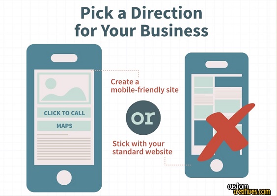
Mobile-friendliness comes in more than one form. There’s the old standby of the mobile-specific website, where your site talks to the browser to determine the device and then, if on mobile, redirects the user to a different site altogether (e.g. from www.example.com to mobile.example.com or m.example.com). Or, preferably, your website can be built with mobile-responsive design, which means it changes its shape and size to adapt to whatever device your users visit on. (View our video on responsive design here.)
Humans generally don’t enjoy the pinch-and-zoom experience of a website that isn’t experienced for mobile devices. Those screens are small enough as it is, and if they have to take extra actions to be able to read the words on your site, that’s a pretty major pain point.
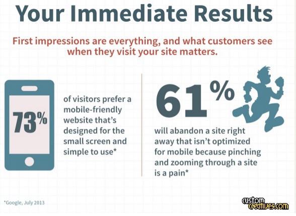
If your customers can’t get what they’re looking for easily, they’re likely to leave your site and go somewhere else (like your competitor’s site – ewwwww). In fact, Google says 61% of mobile users leave a website immediately when they find it’s not mobile-friendly.
Additionally, if your site is not mobile-friendly when the update takes effect, you are likely to see a drop in your rankings, and thus a drop in traffic, online branding, exposure, etc. Some say the drop can be as high as 30% in traffic or more. We can’t be certain of the exact figure but we can be prepared and it’s never too late to join this party.
But there is opportunity here.
Mobile searchers are looking for a good mobile experience – you can give it to them. And if your competitors are the ones without a mobile-ready website, you can eat up the market.
It’s a very easy problem to solve, and it’s an investment with immediate ROI and a long shelf-life.
There are two easy ways:
If the above stats didn’t resonate right away, read them one more time. In short, your customers want to buy from you but if your website is NOT mobile or mobile responsive they will go elsewhere and buy from a competitor or not at all – but more importantly, they are not buying from you which is what really matters the most. In most cases, depending on your webmasters experience and quality of course, you will see an ROI in no time at all.
There are any number of actions you could take, but the most important thing is to ensure that anyone visiting your site on a mobile device gets a user-friendly, mobile-optimized experience.
We happen to have expertise in providing businesses with mobile-friendly websites. We can take your old site and make it responsive, or we can design a new one altogether.
Your business can’t afford to ignore mobile users. Give us a call today to see how much you can save!
The time for mobile is now. Make the shift and get more customers, make more sales, and leave your competition in the rear view mirror.
For a limited time, we’re offering new website customers a free Facebook timeline banner design and profile design. Call us to schedule an appointment (818) 865-1267 or Online before it’s over.

Get your website's SEO strength evaluated and start getting more customers online.
Get My Free Website Audit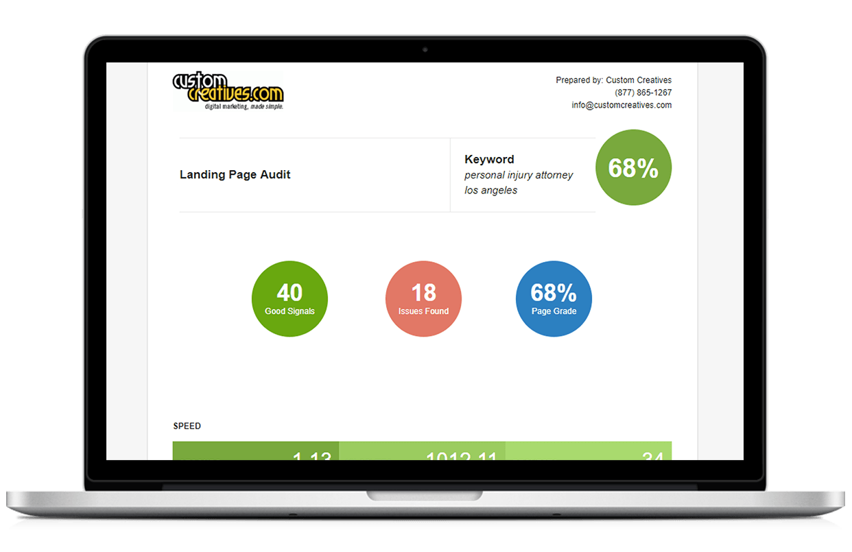


