
As more and more people start their searches on mobile devices such as cell phones and tables, it is now very clear that mobile is taking over internet browsing, searching and selecting businesses to buy from.
Think about this for a second. An impressive two thirds of mobile phone owners use their phone to access the web. With most of the world now mobile, the time to learn and convert to a mobile-responsive website has never been more important than right now.
– 9 out of 10 people search for local businesses.
– 73% of mobile searches trigger an additional action like making a phone call or visiting a business.
– 61% will abandon the site immediately if the design is not mobile-friendly.
– 47% will visit a competitor’s site if they can’t click to call directly from your site.
Your customers are mobile device users. If your website is not mobile friendly, you’re not customer friendly.
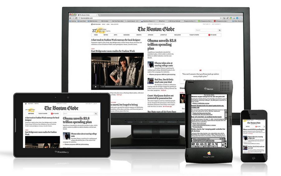
A mobile-responsive website is a website that has been optimized for viewing on nearly any screen in any resolution, from a basic mobile phone to a super-sized desktop monitor. The idea of responsive design boils down to three concrete components: fluid grids, flexible images, and media queries. In other words, it responds to the size of the screen currently viewing the website.
If, for example, you have a row of images on your desktop website, the mobile view might break the images into several stacked rows to accommodate the tall, narrow shape of a mobile phone. Wide navigation bars might get condensed into a drop-down menu. The size ratio of might also change in response to screen size. It will provide the same basic user experience, but without any extra effort or hassle for the user – no pinching to zoom to read impossibly small text, no waiting around for oversized images to load, no scrolling left to right to left again.
There are a number of large brands who have adopted the art of responsive website design and continually improve their customers’ web experience. Starbucks, Time Magazine, T-Mobile and Lexus all have excellent responsive website designs. These are all great sites to learn from while they spend millions or more on user experience, we can all learn from their expenditures.
The examples above describe large companies – what about small and medium-sized businesses? According to independent research by Guy Podjarny of Guypo.com, 7 out of 8 websites are still not responsive.
That is a surprisingly high rate, nearly 88%, of sites that are not responsive considering the rise of the mobile age. It is hard to kick against stats like this one provided by iAcquire: 70% of mobile searches result in action on websites (namely, purchasing) within an hour.
Think about that for a second…
What does this mean? It means that responsive design is your key to increased online sales and greater overall revenue.
In case you’re still not convinced, check these out:
As mentioned above, according to Google:
Since the speed of life is ever increasing, it wouldn’t be surprising to find that this percentage is even higher now. Nobody has time to wait for a site to load just so they can pinch and zoom around the whole page. Responsive websites allows you give your customers a better user experience – not to mention more opportunities for sales!
Remember: 70% of mobile searches result in action. Even if that action is not a purchase, if it is a call placed to your company or a visit to your brick-and-mortar store, the mobile search has still increased your potential to make a sale. In many cases, this increased potential is converted directly into sales.
Mobile responsive phones should have easy actions, such as Click to Call, Maps to locate your store, quick contact forms to make it more convenient to your customers on the go, and even links to email or text message you.
Google has been recommending and supporting responsive websites since 2011. They offer a number of reasons for this support, including:
When the world’s most popular search engine recommends something, it’s generally a good idea to consider their recommendation!
With a responsive website, you spare yourself and your team the headache of designing multiple versions of your website for different devices. Instead, using the fluid grids, flexible images, and media queries that form the basis of responsive design, you can design a single website that will appear seamlessly on multiple devices. This also saves time if you decide to rebrand your company, refresh your current design, or just update the page copy.
Additionally, don’t forget SEO. If you have a separate desktop and mobile website, you’re going to have to run separate SEO campaigns for each. It’s challenging enough to run one SEO campaign effectively; running two SEO campaigns would be difficult, complex, take up more resources and create much more costs to your organization.
According to a statistic on Search Engine Land:
Mobile devices are more accessible, more immediate, and more convenient. Your website must also be accessible, immediate and convenient.
This reason is tied pretty closely to Reason #1. When your customer abandons your site because it’s not responsive, where do you think they’ll go?
For small and mid-sized businesses, losing even a single customer hurts a lot more, especially when you lose them over a preventable issue.
Here’s a true story. I was trying to order from my favorite Indian restaurant the other day so I went on Google on my iPhone and did an exact name search with my geo modifier to ensure I found the exact location I wanted. I click on the result to go directly on the site to quickly check the menu, since it was not mobile or responsive I was unable to read the menu easily.
I decided I would call, but the phone number was just an unlinked image on the top right, so I could not click to dial.
I went to Baja Fresh instead, and I placed an order over $50.
Within one minute, I changed my mind based on the inconvenience that was caused. Had I not been in a rush to get somewhere, I may have stopped by the restaurant, but the next time I think of restaurants on the go, I will be less likely to think of this location.
If a customer struggles often enough with your website on their device, it will hurt their estimation of your company. A company that doesn’t care about its customers’ user experience is viewed as a company that probably doesn’t care about its customers. How long can you expect them to remain loyal if they believe you don’t care about them? You will most likely lose them to your competition since it’s quicker to hit the back button.
Business owners of any size struggle to make the right decisions, to spend their money wisely online and offline, to meet all the other challenges that come along with running a growing business. Responsive website design is not a luxury to have, it’s a must if you want to compete. Buying a new chair or getting speakers for your office, even coffee for you staff are all areas to save money – a mobile-friendly website is not. It is a fundamental must, just like paying taxes.
The way your customers search online has changed with the tremendous growth of mobile devices. It’s imperative that businesses keep up. Having a well-designed, mobile-friendly website is one of the most important marketing assets your business needs to have. You don’t have to break the bank to create a website, but you should certainly partner with a company that is experienced in responsive website design.
The more quality experience your agency has, the more you will benefit with the right decision.
If you already have a mobile responsive website, great job! Now it’s time to optimize for better user experience and better search engine visibility, and keep that website updated!
Need more help understanding how responsive website design works? Call us and get the scoop at 818-865-1267, or contact us online.
And for additional website tips…

Get your website's SEO strength evaluated and start getting more customers online.
Get My Free Website Audit


